
How to read the Actionability Matrix?
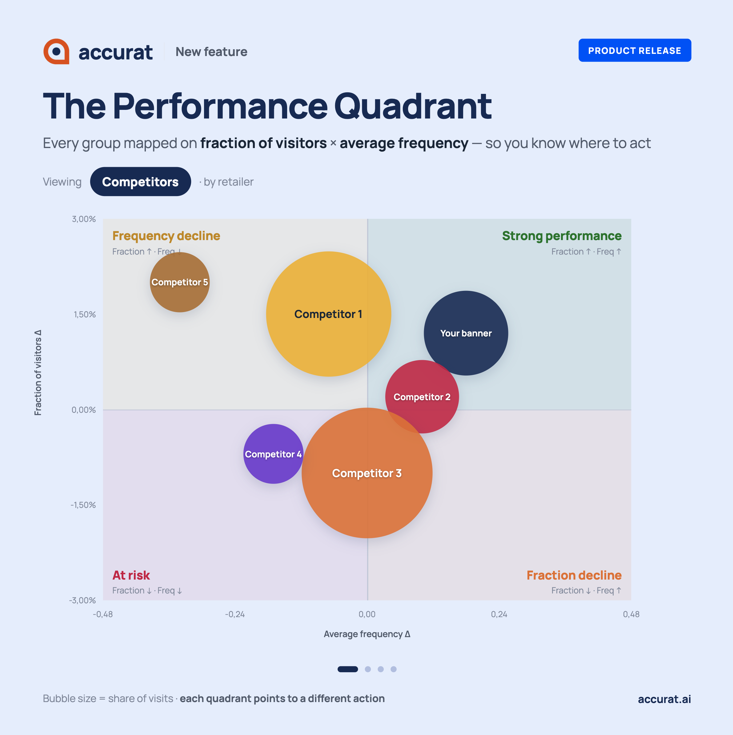
The Actionability Matrix or Frequency & Fraction chart is one of Accurat's core visuals. It answers a single strategic question: where are you winning, and - more importantly - where do you need to act? This article explains the three underlying metrics, how to read the chart, and how to use it in practice - both when analysing your own performance for a specific period, by segment of by store group and when benchmarking against competitors.
The three building blocks
Every number in this chart traces back to three metrics. Understanding their relationship is the key to reading the chart correctly.
- Share of Visits (SoV) is the outcome metric. It measures the share of all shopping trips in the market that went to your stores - your visits divided by total market visits. This is the headline: are you growing, holding, or losing ground?
- Fraction of Visitors (FoV) is the reach driver. It measures what share of all shoppers in the market visited your stores at least once in the period - your unique visitors divided by total market unique visitors. It answers: are you attracting enough people?
- Average Frequency is the intensity driver. It measures how often your shoppers visited during the period - your visits divided by your unique visitors. It answers: are the people who come, coming back enough?
These three are mathematically linked:
Share of Visits = Fraction of Visitors × Average Frequency
This means your Share of Visits is driven by two levers: reaching more people (Fraction ↑) or making existing shoppers visit more often (Frequency ↑). The chart shows which lever is moving - and in which direction.
But there is a third lever: the market. Because Share of Visits is a relative metric, your SoV can change even when your own Fraction and Frequency stay flat - simply because the market is growing or shrinking around you.
Some occasions in which this third lever is dictating your result:
- If you and all your competitors grow at the same pace, your SoV stays flat even though your absolute visitor numbers rose.
- If the market contracts faster than you do, your SoV can rise even though both your Fraction and Frequency are declining.
- If a competitor accelerates, your SoV can fall even though you are growing on both dimensions.
This is why SoV is the primary signal. It tells you whether you are outperforming, matching, or underperforming the market - regardless of what your absolute numbers are doing. The quadrant position on the chart explains which lever is moving; the SoV direction tells you whether it's enough.
How to read the chart
The axes
The chart plots changes (∆), not absolute values. Both axes show how a metric has shifted compared to the reference period.
- Y-axis - Fraction ∆: Did the retailer or segment attract a larger or smaller share of shoppers? Positive = growing relative reach. Negative = shrinking relative reach.
- X-axis - Frequency ∆: Did shoppers visit more or less often? Positive = increasing visit intensity. Negative = decreasing intensity.
Bubble size
The size of each bubble reflects Share of Visits - how significant that retailer or segment is in total store traffic. A large bubble means high current importance; a small bubble means a smaller slice of the market. This gives you context: a decline in a large bubble is a bigger issue than the same decline in a small one.
The four quadrants
The chart is divided into four quadrants, each with a clear label and strategic meaning.
Frequency growing (right) | Frequency declining (left) | |
|---|---|---|
Fraction growing (top) | Strong performance - growing on both reach and intensity | Frequency decline - reach grows, but shoppers come less often |
Fraction declining (bottom) | Fraction decline - shoppers are loyal but reach is shrinking | At risk - declining on both dimensions |
Strong performance (top-right)
Both Fraction and Frequency are growing. This looks like the best position - but what it means depends on your SoV direction. In some occasions multiple market players might be growing their stronghold, meaning the market is growing in terms of frequency and fraction. In this case only the best performers actually see their Share of Visits grow.
SoV direction | What it means | Action |
|---|---|---|
SoV ↑ | You are outperforming. Growth on both dimensions is pulling you ahead of the market. | Protect momentum. Understand what is driving both levers and double down. |
SoV flat | You are growing in line with the market, not ahead of it. Competitors are making the same gains. | Don't celebrate yet. Find the edge: which dimension can you accelerate to pull ahead? |
SoV ↓ | The market is accelerating faster than you despite your own growth. | Red flag. Identify which competitor is pulling away and on which dimension. |
Frequency decline (top-left)
Reach is growing - you are attracting more shoppers - but they visit less often. Reach is doing the work; loyalty is leaking.
SoV direction | What it means | Action |
|---|---|---|
SoV ↑ | Reach growth is currently compensating for frequency loss. Short-term win, structural risk. | Fix frequency before it erodes SoV. Investigate what reduces repeat visits: pricing, convenience, competitor promotions, or assortment. |
SoV flat | Reach gains and frequency losses are cancelling out. You are moving with the market. | The frequency decline is a warning sign. Address it before it pulls SoV below market. |
SoV ↓ | Reach investment is not paying off. Shoppers arrive but don't stay loyal. | Investigate churn triggers. Acquiring visitors without retaining them is costly and unsustainable. |
Fraction decline (bottom-right)
Existing shoppers are visiting more often, but you are reaching fewer people. Frequency is compensating for a reach problem - but only temporarily.
SoV direction | What it means | Action |
|---|---|---|
SoV ↑ | Frequency is more than compensating for the reach loss. | Appreciate the loyalty signal, but prioritise acquisition. Frequency cannot carry SoV indefinitely if reach keeps shrinking. |
SoV flat | Frequency is buying you stability, not growth. | Monitor reach closely. If Fraction decline continues, SoV will eventually follow. |
SoV ↓ | Frequency is not enough to offset the reach loss. | Prioritise acquisition and reactivation. Focus on why shoppers are not choosing you for their first visit - awareness, location, format, or price image. |
At risk (bottom-left)
Both Fraction and Frequency are declining. This is the most urgent signal.
SoV direction | What it means | Action |
|---|---|---|
SoV ↑ | Unusual combination - verify data. If valid, the total market is contracting faster than you are. | You are losing less than competitors, but still declining in absolute terms. Monitor closely; do not mistake market contraction for strength. |
SoV flat | You are declining in line with a declining market. | Not an emergency if market-wide, but no room for complacency. Identify which competitor is holding steady or growing against the trend. |
SoV ↓ | Most urgent scenario. You are losing ground on every dimension simultaneously. | Immediate diagnosis required. Identify which lever has the faster impact and act on it first. |
Two ways to use the chart
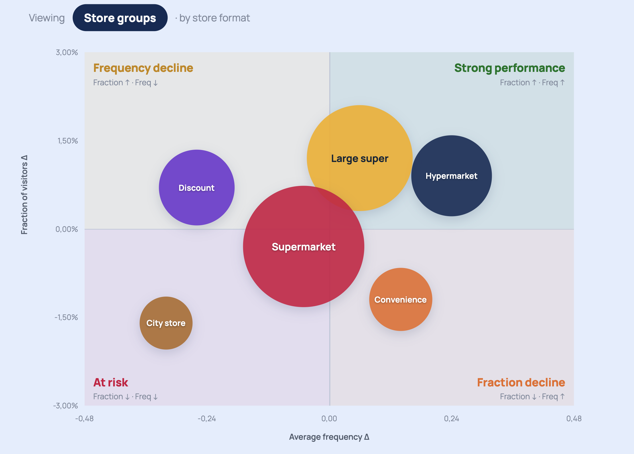
Use case 1 - Where, who & when to grow? Understand segments, regions, store groups and days
Here, each bubble is one of your own segments (e.g. an income group, a region, a store format, or a day of the week). The chart tells you how each performs for your brand.
- Strong performance: these are your anchor groups. Always check SoV direction - if SoV is flat despite top-right positioning, you are merely keeping pace with the market, not pulling ahead.
- Frequency decline: you are reaching these shoppers but losing repeat visits. Investigate loyalty blockers: pricing, convenience, competitor promotions. If SoV is already declining, this is urgent.
- Fraction decline: these shoppers return when they come, but you are not winning them at first contact. Focus on acquisition and reactivation. If frequency is strong but SoV is still falling, reach decline is the root cause.
- At risk: both dimensions declining. Cross-check with SoV: if SoV is also down, this is your highest priority. If SoV is flat or up, the whole market is contracting - different problem, different response.
Bubble size matters: a large bubble in "At risk" with a declining SoV is your most urgent problem. A small bubble in "Frequency decline" may be a signal to monitor, not an emergency.
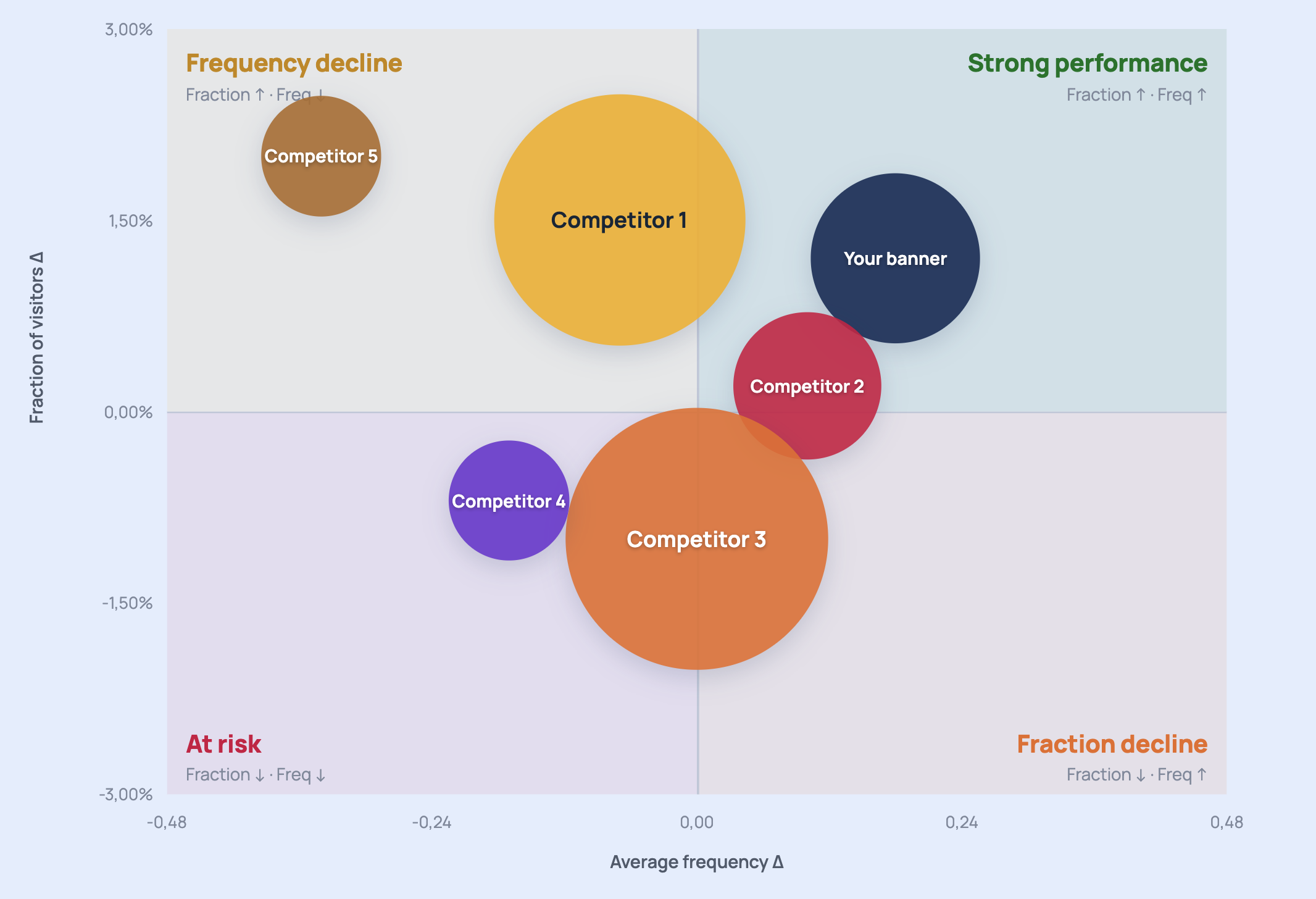
Use case 2 - Retailers or competitors plotted for one segment, store group or day
In a periodic report or a deep dive report, the same chart is applied to a specific period, a single segment (e.g. Welstandsklasse W1), a region (e.g. a Bundesland) or a store group (e.g. your city franchisers) or even a day (e.g. Sundays) with each bubble representing a different retailer. Now the chart answers: within this specific audience, who is gaining and who is struggling?
The quadrant labels shift in meaning:
- Strong performance: this competitor is winning with this period or the chosen subset - growing both reach and frequency. They are a threat.
- Frequency decline: this competitor is attracting more of this month’s, segment's or store group’s or that day’s shoppers, but those shoppers come less often - a potential vulnerability you can exploit.
- Fraction decline: this competitor's shoppers are loyal but it is reaching fewer people in this selection - a niche player, not an immediate threat on reach.
- At risk: this competitor is losing ground - an opportunity to capture those shoppers.
Each bubble comes in clear colors, linked to the brand’s main color mostly, helping to easily identify both yourself and your main competitors.
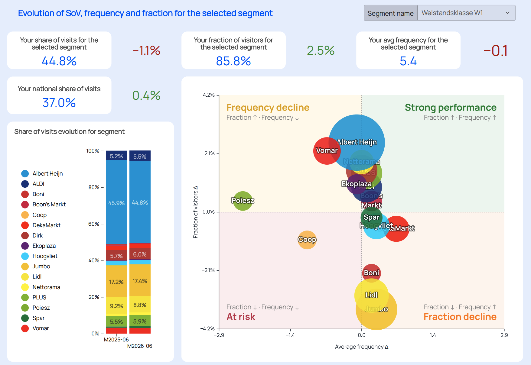
Reading an example: Albert Heijn in Welstandsklasse W1
The deep dive report for June 2026 shows Albert Heijn's position among Dutch grocery retailers, filtered to the Welstandsklasse W1 segment (the highest income group).
Key figures for Albert Heijn within W1:
- Fraction ∆: −1.1% - Albert Heijn is reaching a smaller share of this segment's shoppers compared to June 2025
- Frequency ∆: +2.5 visits - the shoppers it does retain are visiting more often
- This places Albert Heijn in the Fraction decline quadrant for W1
The story: Albert Heijn is holding its loyal W1 shoppers (frequency is strong) but is losing reach within this group. Competitors like PLUS (+0.4% Fraction), Dirk (+0.3%), and Nettorama (+0.4%) are all growing their share of W1 shoppers. The action signal is clear: investigate what is pulling W1 shoppers away on first contact - assortment positioning, price perception, or format fit.
Practical tips
Start with bubble size, then read position. A large bubble in "Fraction decline" is a structural issue. A small bubble in "At risk" may be a signal to monitor, not an emergency.
Fraction and Frequency are drivers, Share of Visits is the outcome - and the market is the context. The chart shows you why your drivers are moving. SoV tells you whether it's enough relative to the market. A retailer growing on both axes but with flat SoV is simply keeping pace; one declining on both axes but with flat SoV may be holding position in a shrinking market. Always read quadrant position and SoV direction together.
The reference period matters. Both axes show deltas - the chart always compares two periods. Make sure you are comparing equivalent periods (e.g. year-over-year) to avoid seasonal distortion.
Use the segment toggle to layer context. The same retailer can sit in different quadrants for different segments. A nationally "Strong performance" position may hide a "Fraction decline" problem within a specific income or age group. The deep dive report surfaces exactly this.
Quadrant position is a diagnostic, not a verdict. A retailer in "At risk" may be executing a deliberate format rationalisation. A bubble in "Strong performance" may be benefiting from a temporary promotion. Always combine the chart with qualitative context before acting.
Metric definitions
Metric | Formula | What it measures |
|---|---|---|
Share of Visits (SoV) | Retailer visits ÷ Total market visits | Overall market position (outcome) |
Fraction of Visitors (FoV) | Retailer unique visitors ÷ Total market unique visitors | Relative reach (driver) |
Average Frequency | Retailer visits ÷ Retailer unique visitors | Visit intensity per shopper (driver) |
Fraction ∆ | FoV current period − FoV reference period | Change in relative reach |
Frequency ∆ | Avg Freq current − Avg Freq reference | Change in visit intensity |